Monday, December 30, 2013

Irish Strength (eBook edition) is now LIVE

Irish Strength, Book One of The Irish Treasures Saga, is now LIVE in the Amazon Kindle store.

Thanks to Kindle Direct Publishing being ahead of their game this week, the 24-48 hour approval process that would've matched the release date for Jan 1 only took A FEW HOURS!!! Not that I'm complaining! :)

The print edition is a slower process (thanks CreateSpace) and should be ready for the original release date of Jan. 1.

Remember, when you buy the print edition you can get Kindle's matchbook pricing for the eBook, which is only 99 cents!

Here's the links:
United States customers: http://www.amazon.com/dp/B00HLKY9ZE
United Kingdom customers: https://www.amazon.co.uk/dp/B00HLKY9ZE
Canada Customers: https://www.amazon.ca/dp/B00HLKY9ZE

I hope you enjoy Irish Strength! Happy reading!


Thursday, December 26, 2013

Upcoming Release Preview - Thursdays with the Author

So my next book, Irish Strength, is scheduled for release Wednesday, January 1, 2014 so instead of my usual Q&A session, I will be giving you all an exclusive preview! 

Irish Strength is the first book in The Irish Treasures Saga. The remaining books are Irish Heart, Irish Sight and Irish Truth

Here's the back cover blurb:

Long ago, before men came to the shores of Ireland, there lived a race of gods who fought a great evil to keep their island from sinking into the sea. Knowing men were destined to rule the land they loved, the gods created four great treasures to guard their beloved isle should the great evil rise to destroy it once more. Thousands of years would come to pass before the treasures were needed, before man would have to fight, to save Ireland from destruction.  

Morgan MacQuill flees America with her newborn son, running from an abusive husband. She finds herself in Ireland, with family she never knew existed. She soon discovers a heritage and power kept hidden from her and a destiny that will change her life forever.  

Quinn MacGreen has dreamed of a mysterious blonde woman his entire life. He meets his new neighbor, Morgan, and is shocked to see she has stepped out of his dreams and into reality. He struggles to accept his fate while protecting the woman he doesn't want to fall in love with. Morgan’s estranged husband begins a deadly search for her and Quinn must do everything in his power to keep them safe. 

When an ancient evil returns to destroy the world, Morgan and Quinn must work together to guard a great treasure forged by Celtic gods. Morgan’s past collides with the evil they are battling and the mythical war they are fighting becomes personal.  


With a mix of magic, suspense and plenty of romance, Irish Strength will take you on a journey that turns myth into reality and proves that love really is the most powerful magic of all.


And now, a preview of Irish Strength.


Morgan found the path easily as the sky started to lighten. The mist began to recede as she walked further on. Her breath made clouds of steam, trailing after her as she came closer to the end of MacQuill land.
The empty silence was broken by a quick whack followed by two thuds. Curious, she stepped off the path towards the noise. The closer she got the MacGreen Castle, the louder it became, joined now by a distinct male grunt. Rounding the hill, she found Quinn, chopping firewood in the hazy, pre-dawn light.
Stopping suddenly, Morgan watched as he continued to split log after log in rhythmic precision. She could see his muscles outlined beneath his wool blazer. His breath came in short puffs from sculpted lips. His long legs braced apart, shifted slightly as he reached for another log.
She didn’t understand any of this: why he was here, why she’d dreamt of him for so long. Since the night Braden was born, her whole life seemed to have turned upside down.


Quinn had felt her coming, long before she rounded the bend. He let her watch him as he continued to swing his ax, slightly annoyed at the emotions he sensed from her. Surprise and confusion. But mostly desire; hot, quick and very passionate. He barely had to probe to see it, making his male arrogance swell with pride.
Then he sensed her shame and saw her quick blush out of the corner of his eye. His temper flared with anger. Fate had pushed them together though it seemed it was what neither of them had wanted.
“Top of the mornin’ to ye, Morgan,” he called before swinging the ax again. She jumped when he spoke; clearly unaware that he had seen her.
“Do the Irish really say that?” she asked, stepping closer to him.
“Rarely and mostly for tourists,” he answered, wiping the sweat from his forehead. “Yer Uncle Jamie is rather fond of the phrase though. I thought ye’d enjoy it.”
“Thanks,” she answered, a smile threatening on her face.
“Yer out early.” Quinn set the ax against the stump and sat down on a large log.
“Jetlag,” she answered. “And I, uh, wanted to see the sun come up,” she sat down on a log next to him. “It’s the first day of my new life.” Quinn nodded his head in approval at her words. Whatever his feelings against destiny, he was beginning to like this Morgan MacQuill.
“Castle MacGreen sits on high elevation,” he explained, pointing off to the East. “The perfect place to watch the sunrise. Yer more than welcome to stay.”
“Thank you,” Morgan answered. “Are all Irish people so welcoming to strangers?” she asked as the sky became brighter. Quinn just shrugged and looked towards the sky.
In the East, just over the mist-covered hills, the sun was beginning to peak over the horizon. Morgan gasped as the sky became brilliant with oranges, reds and pinks. The dew on the grass sparkled as if each blade had been covered in diamonds. She swore she could feel its warmth filling her up.
“It’s amazing,” she whispered, wrapping her arms around her middle. Quinn snorted in response, not wanting to like this woman any more than he already was.
“Come in and have a spot of tea before ye go back.” Quinn stood suddenly, wanting to end the magic that he could feel radiating through the sunrise.
“I should get back to Braden,” Morgan began, standing up next to him.
“Bridget will look after him,” he answered gruffly. “Ye look pale and ye probably haven’t eaten yet, eh?”
“No, I…”
“And ye just walked a mile in the cold and dark in an unfamiliar place.”
“Yes, but…”
“No buts,” he interrupted again. “Come, have some tea.” He turned towards the castle and began walking away, smiling to himself when he heard her follow behind him.
They'd no sooner taken two steps before a big, dark shape came rushing around the corner, straight towards Morgan. Seeing it, she squealed in terror, freezing in the middle of the path. Quinn shouted for the animal to stop but it was too late. The mass of fur and muscle was already leaping towards her. The last thing Morgan saw was large, yellow eyes locking onto hers before slipping away into blackness.


“Morgan,” the Irish lilt had become rough with concern. “Open yer eyes.” Her eyes fluttered open and locked with golden ones, full of worry.
“Are ye hurt?” Quinn asked softly. Swallowing the lump in her throat, Morgan struggled to sit up.
“I don’t think so,” she mumbled, brushing a few clumps of grass from her hair. “What the hell was that?”
“My damned dog, that’s what,” Quinn growled, pulling Morgan to her feet. “Bloody wretch does’na listen to a word I say.” The dog in question, huge by anyone’s comparison, chose that moment to come trotting up to Morgan. Her face paled slightly at the size of the animal but she bravely reached out a hand for it to smell. Slowly, the dog stretched its nose towards her hand, sniffing furiously.
“Hello there,” Morgan whispered, smiling at the dog. “You gave me quite a scare. But you didn’t mean to, did you?” The dog cocked his head and stepped closer to her. “You’re awfully handsome.” It woofed in response. “And you know it too,” she giggled.
Welcome, Morgan of the MacQuill’s.”
The voice in her mind was loud, strong and utterly canine. Morgan shook her head, wondering if she’d bumped it harder than she’d thought. The dog simply stared at her with an expression that closely resembled a smile. Quinn had heard the welcome and ground his teeth in frustration. Even his dog liked her.
“I do believe you have yourself a wolf instead of a dog, Quinn.”
“In a manner of speaking,” Quinn answered, finally smiling. “He’s an Irish Wolfhound.”
“Of course he is,” Morgan answered, dryly.
“Merlin, meet Morgan. Morgan, this is Merlin.”
“Merlin?” she asked, raising an eyebrow.
“The mutt does’na live up to the name,” Quinn answered, smiling broadly. “But he’s usually a good dog. Just wanted to come say hello to ye.”
“By knocking me off my feet?”
“Aye well, he needs some work on the finer points of greeting a guest,” Morgan wobbled on her feet as she tried to laugh. Quinn reached out to steady her before she fell. “Ye all right, lass?”
“Mmm, yes. Just a little dizzy.” Before she could object, Quinn swept her into his arms and began to walk towards the castle. “Quinn, put me down,” she growled, pushing against his solid chest.
“Don’na need ye going into a faint on my land,” he answered, not listening to her orders. He tried not to think about how light she was in his arms or how sweet she smelled. Like lilacs and spring. “Bridget would have my hide,” he complained, trying to distract himself.
“Really, Quinn,” she protested. “I’m fine.”
“We’ll see,” he answered, easily opening the large oak door with one hand. He unceremoniously dropped her down in a kitchen chair and went to pull a kettle off the hearth. Coming back to the table, he poured her a cup of tea and sat down opposite of her. “Try it,” he told her when she didn’t move. Sighing, she reached for the cup and took a tentative drink.
“It’s delicious,” she admitted, taking another drink.
“Tis’ one of Bridget’s concoctions,” he told her as she drank more of the steaming tea. He realized he was smiling at her and quickly dropped the grin. He wouldn’t allow fate to push him into something that he wasn’t willing to do. Wanting her to dislike him, he decided to be blunt with her.
“So, did Clare tell ye that yer a witch?” he asked, calmly. Morgan spluttered into her tea and coughed to clear her throat.
“Excuse me?”
“She did’na tell ye?” He kicked his feet up onto the table. Morgan stared at him, unsure if she should be laughing at an attempt at a bad joke but he just stared at her with no expression at all.
“That’s not funny, Quinn,” she said, carefully.
“Of course it is’na,” he answered. “She should’a warned ye about who ye are,” he raised an eyebrow as confusion ran across Morgan’s face. “She should’a warned ye about all of us.”
“Warned me about what?” Morgan asked, fear trickling down her spine.

“That we’re witches too.”


Irish Strength will be available through Amazon and CreateSpace (print) and the Amazon Kindle Store (eBook) starting Wednesday!

Thursday, December 19, 2013

Naming Your Characters - Thursdays with the Author


Before I get going with this post I'd like to wish you all a very Merry Christmas! The big day is only 6 days away! My kids are literally bouncing off the walls waiting for Santa to come. My favorite part of the holidays is making it absolutely magical for my kids. My second favorite thing is being able to spend time with my family and in-laws. We always have a great time and the food is, to put it mildly, amazing. :) 
I hope you all have a great Christmas!

I'd also like to remind everyone that my next book, Irish Strength, The Irish Treasures Saga Book One, is being released January 1, 2014. It will be available through the CreateSpace store, Amazon and through bookstores and libraries. 


Now for the Thursdays with the Author post! ;)


Reader Question: 
When thinking of names for your characters, what inspires you? How do you come up with unique and original names for so many characters?


Answer: 
Names are hard. Sometimes even harder than writing the actual book.
When I started Dark Mountains, I was young, only 18, and I definitely hadn't seen much of the world. The majority of the book was written while I was pregnant with our first child and as we were waffling on names for our baby boy, I was doing the same thing with the characters in my book. Dark Mountains takes place in Eastern Kentucky so I had to use names that would fit the region as well as the characters. We named our son Colton (Cole for short) and I wanted to share his name with the hero of my book. Cole (in the book) is a young man who is very loyal, puts the well being of others above his own, sacrificed to serve his country, and married the woman he loved. I wanted my son to grow up with the same morals and character as the hero in my book, so I decided to keep their names the same. I have no idea if my son will appreciate this when he's older though! 

Another name I used was my mother's (Sheri). She is Cole's mom in the book. The only other name I settled on that had a direct link to my life was using Heinrich as the last name of the German doctor that takes care of Cole after he's injured in the war. Hopefully my brother-in-law doesn't mind the use of his surname but I couldn't resist since it needed to be a German sounding name and his is conveniently just that. ;)

In my next book, Irish Strength, the names were even harder. The majority of the book takes place in Ireland and names from other countries and cultures are extremely different than common names here in the heartland of the US. So not only did I have to find names that fit the culture and country, I wanted my names to mean something. 


Trace Your Gaelic Roots - Trace your Irish heritage and find out where your Irish surname originated from.

For example: In book one, Morgan (the modern version of Morrigan) is the heroine. She's fleeing from an abusive marriage and finds shelter and safety in Ireland with family she's never met. She discovers that she's actually a witch and a descendant of one of the first high kings of Ireland. Because of that heritage, she is pulled into a mythological war against an ancient Celtic monster. Morrigan means 'Great Queen' in Irish. In Celtic mythology, Morrigan was the goddess of war, death and fertility.

Also in book one, Quinn (short for Quinton), is also a witch and descendant of one of the original high kings. He is also next in line as head of his family. He is destined (with Morgan) to be the protector of one of the Irish treasures. Quinn means 'wise counsel' in Gaelic.

When writing fantasy, an author has much more freedom with names. Since you're making up the majority of the book, you can also make up the names. But at the same time, you have to be careful. A reader isn't going to enjoy taking five minutes to try and pronounce the name. Fantasy name builders tend to draw their inspiration from old names that are no longer used. Latin, Greek, Hebrew, Old English, Scandinavian, etc. Today we use the anglicized, easy-to-pronounce versions. Use the older versions of the name, even tweaking them a little. 

So some tips for naming your characters: 
(FYI these are just TIPS, not RULES)

1) Try to draw inspiration from the personality of your character

2) Names tend to have different meanings to different cultures. Check the meanings and find one that fits

3) Don't pull names from only ones familiar to you. Check out the top 100 names for specific countries, look up old-world languages, common names used hundreds or thousands of years ago, etc.

4) Don't go overboard with spelling and pronunciation. Readers hate not being able to say a name in their head, or read it a certain way through the whole book only to find the glossary in the back saying it was wrong. (Think Harry Potter: A lot of us were saying Hermione's name wrong until Goblet of Fire when she taught another character how to pronounce it.)

5) Names can always be changed in the editing process. If you're stuck and can't find a good fit, finish your novel with a generic name and go back and read through it. Look for the characteristics, attitude, physical attributes of each character throughout the book then find a name that fits.

6) Read other books from your genre. DON'T use the same names as another author, especially in the same genre.

7) If you're writing in a certain culture, country or time period, the names NEED to match where and when you're writing your story in. A LaKeesha isn't going to be a common name in Sweden. Agnes isn't going to be normal in the Caribbean. Su Ling isn't Canadian. The same goes with the time period. If you're writing historical romance names like Axel, Zahara, North, etc. are not names that would be used 200+ years ago.

Thursday, December 12, 2013

Creating a Cover for Your Book - What NOT to do - Thursdays with the Author

Update: the Coverscroll website is no longer running. But if you go to google search and type in bad book covers, you'll see exactly what I'm talking about. ;)


The cover for one of my books

I always check out my new Twitter followers and one of my newer ones this week was a website that will let you promote your book for free (donations accepted) which I think is a great resource for writers. 

As I was browsing their website I saw perfect examples of what self-publishing and indie press authors should absolutely NOT DO when it comes to designing a cover for their books. 


There are some good covers that I found, which I will feature further down in this post (with the author's permission). Of the good ones, seen below, I read the blurbs after the cover caught my eye. And I will most likely purchase all of them because I like how they sound. But the first thing that caught my attention (as a reader) were the covers.

Some of these good covers were done with publishing and/or design companies. If you have the money and/or means to go this route, please do. They know what they're doing. But if you don't, the list of do's and (mostly) don'ts found below can help you make a great cover on your own.

I won't post individual pictures of the 'what not to do's' at the risk of being sued by someone so you'll have to check the website out for yourself. It'll be pretty easy to understand what I'm referring to. Take a look and see what you think: http://coverscroll.com/


Here's a few tips I have for designing a cover. They are mostly (well practically all of them are) what NOT to do:

1) Do NOT use a friend or family member as your model just because you needed someone to pose for a picture. Having an obese woman in lingerie trying desperately to look sexy and failing badly while holding a giant carving knife between her bare legs is a BAD IDEA. This is NOT the cover you want to have unless you main character is a overweight serial killer that has some strange sexual fantasies, then the cover might fit but it still won't get anyone to read your book. 

2) Do NOT use a crappy, pixelated picture that looks like it was taken by your five year old child on a toy camera. Pictures should be clear with a high DPI (most sites recommend 300DPI). That means a very high resolution shot if you didn't know.

3) Do NOT take a picture you found off a Google search engine and slap it on your book then paste some really crazy looking graphic on top of it with your book's title and your name squeezed in the only free space. Just don't. Also see #12.

4) Do NOT use a hand-drawn image/picture as your cover. The ONLY exceptions to this would be if you are an amazing artist (professional schooling is a big plus here) or your book is a children's book. I will be so distracted wondering what the heck you even drew on your cover that I won't even read your blurb or check out your reviews. Books ARE firstly judged by their covers so don't make the mistake of putting a elementary school quality artwork on your cover. Books are secondly judged by their blurbs. Your cover will get them to read your blurb so make sure it is good too!

5) Do NOT put small/confusing fonts,  subtitles, or small blurbs on the front cover. This goes for cover images as well. Most people will be looking at a thumbnail image of your book's cover. If it doesn't look good or can't be seen in a thumbnail, you need to change it.

6) TEXT: I have a few points on this topic. 
A) Make sure all the words and letters can be CLEARLY seen and EASILY read. Images and backgrounds should not be cutting into lettering or obscuring them from vision. 
B) FONT: One example I can give is: the word 'Aunt' looks like the word 'Cunt' in certain fonts. Seriously. (For those of you outside the US, here the word cunt is a very derogatory word, usually directed towards women. Not the word you want in your title or in thanking your Aunt on the dedication page.) 
I saw a few titles with the letter 'D' in a font that appeared to be dripping blood. It made the 'D' look like a 'P'. This makes the word Deed look like Peed and Doubt look like Pout. It would look bad if your title read 'Without a Pout'. DOUBLE CHECK to make sure your font isn't causing these type of issues. This also ties in with #5. Some fonts cannot be read as thumbnails. Check your fonts. 
C) DO NOT use the shadow effect on your title. A lot of the books on this site had the words being mirrored underneath. This is distracting and looks amateurish. 

7) Titles. Please don't have your title be fifteen words long. JUST DON'T. Also, titles should also have something to do with your book. Foreshadowing or theme. But not so literal as the reader wants to do a face palm. Example: Your book is about a serial killer who dresses up as Santa and murders Christmas shoppers. DO NOT call your book Serial Killer Santa. Killer Christmas is cliche (also: will probably cause an eye roll or face palm) and it's STILL better than Serial Killer Santa.

8) Unless you are writing a children's book or certain types of non-fiction, or an ACTUAL comic book, your cover should NOT look like a cartoon.

9) If there are multiple authors, it might be best not to name every single one of them on the cover of your book. Try: 'A collaboration' or something like that and list the authors/contributors in detail inside the book.

10) If you're going to have half naked, mostly naked, scantily clad, suggestive, provocative, etc. person(s)on your cover, make sure you do the following: 

A) The scene actually has something to do with your book. A tropical paradise complete with ocean waves and palm trees with bathing suit clad hotties rolling in the sand should not be on your cover if the book takes place in Minnesota... in the winter.
B) The people are at least somewhat attractive. Let's be honest here. We know men and women, in real life, are not perfect. Most of us don't even care what our significant other looks like (well maybe we care a little). But we read to escape reality and that escape isn't a man with a beer belly who's too lazy to shave or a woman with more chins than fingers. We want to see six pack abs and a hint of a five o'clock shadow on a sculpted face, or legs (preferably shaved) that go for miles and perfect boobs. Reading is fantasy so it's okay for us to indulge in our unrealistic and stereotypical fantasies.
C) The pose is somewhat attractive and age appropriate. A reader isn't going to want to read your 'steamy erotica' if they're too busy laughing at a ridiculous cover.  Example: A grandma-aged woman with her legs spread out and the title of your book barely covering the part of her body we really don't want to see. A reader is also not going to want to read about someones 'biggest hustle' yet the person on the cover doesn't look old enough to even know what a hustle is.
D) This ties in to #1 and #2. The picture needs to be good quality. The models need to be professional.
E) Just because it's a romance novel doesn't mean you have to have two half-naked people making out or tearing each other's clothes off on the cover. Don't get me wrong, that doesn't stop me from reading romance novels but cover after cover of horny couples gets a little old. This doesn't mean that you shouldn't put two hotties getting it on for your cover, just don't go overboard with it and try not to let it look too cliche.

11) Check the color! Especially with the cookie-cutter templates some self-publishing companies give you to choose from. If the background is pale/white, all that may show up on your cover may be the title and image. Make sure the color is dark/different enough to see the entire cover regardless of the background color of a website or make sure you have a thin border around your cover to distinguish it's lighter background from the web site's color.

12) For those of you completely new to publishing/self publishing, the biggest thing you need to know is that you absolutely have to have permission to use someone else's image. This may seem like a no-brainer but some people don't realize this fact. Just because you found a great image on a Google search doesn't mean there's no copyright. Most images on the Internet are copyrighted. Using a copyrighted image without permission from the original owner is ILLEGALSometimes getting permission is as simple as asking the owner of the image to use it. Sometimes it's impossible to even find the owner. Sometimes the owner wants compensation (aka $) or credit in your book. If you can't get permission, DON'T USE IT. You don't want to risk getting sued. Even in this blog, I found the author's to all the books listed below and asked for permission to use their images and names before posting.

Here's an example: For my next book, which is being released in a few weeks, I found an AMAZING shot of an Irish castle. After scouring the Internet for the original owner of the image, I found him (in Greece, no less) and asked what I'd need to do to obtain permission to use his photo on the cover of my book. A lot of international emailing later and the deal was made. In exchange for using his photo (for my book cover and marketing for said book ONLY) I needed to give him credit on the back cover of my book for the photo, send him a copy of the cover for pre-approval before publishing, and send him 2 copies of the book after publishing. I got lucky finding a very polite and generous owner to negotiate with. I did go a little overboard and asked for a signed 'contract' just to cover my butt in the future, and he graciously complied. 


Another example: My cover of Dark Mountains is just a background image of mountains. I had found this picture that I absolutely loved, of a marine kissing his girlfriend's forehead. It was a sweet and beautiful B&W image and completely fit the theme of my story. There was no skin or suggestive situations, only a soldier in uniform saying goodbye with a innocent kiss. (Not saying my novel didn't have sex in it but it follows the main character's love story from childhood best friends and the sweetness fits the overall theme better. Also I have a thing against every romance cover having half naked-people on it. See #10. But I digress.) 

I emailed the blogger where I found the picture and asked if she could direct me to the original owner. She emailed me back saying that she had obtained permission to use the photo on her blog but could not find her info on the picture's owner (the cynic in me was screaming B.S.). But regardless, I couldn't find the original owner and couldn't get permission so the picture that I absolutely loved couldn't be used. I still haven't found an image that I love like that one, which is why Dark Mountains still has a somewhat plain image as the cover. I'd rather have a great, non-distracting background image than a picture that doesn't fit my book.

When it comes to finding owners and gaining permission, it won't always be that easy and sometimes it won't even be that hard. But if you want the image on your cover, you have to do what it takes to get permission.


Some images and artwork are so old that they don't have a copyright. Check your country's copyright law before using any images that are 100+ years old.

13)  If you can, if you have the right program and expertise, DO design your own cover from scratch. Cookie cutter templates from sites like CreateSpace, SmashWords, Kindle Direct, etc. are just that. Cookie Cutter. Regardless of how many choices they offer you, someone else will have the same looking image or template. Even with the 2 million + titles (and that is just in the Kindle store) someone will use the same template, colors, etc. 

If you can create your own cover from scratch you have much more freedom with color, fonts, layout, etc. But it's also harder. You have to know exactly how big your book is, page count, size, bleed, spine width, etc. There's even a math equation to figure out exact dimensions. It's all very confusing. But if you take your time and learn as much as you can BEFORE trying it, it isn't as scary as it first appears. I personally use Microsoft Publisher but there are MANY other programs you can choose from.


14) DO get opinions from as many people as you can before publishing with your cover. Friends and family are great, but be honest with yourself, they may not be up front in their opinions because they are family or a friend. Facebook, Google+, Twitter, Community boards on the self publishing sites: All of these are good places to get opinions on your covers. Now keep in mind, just like with your actual book, you won't please everybody. But if the majority likes it, then they're probably right. If the majority hates it, don't get too upset. Use it as a chance to learn. Ask for honest critiques and advice, and take it when given. 

The great thing about being an author is that it isn't a cut-throat business. Authors aren't out to sabotage each other. At least not in the self-publishing realm. We help each other. We learn from each other. Remember that fact when someone tells you your drawing is pretty bad and you shouldn't use it. Don't get pissed. Try looking at it like it isn't yours and you may find they were right.


15) Series: If your book is part of a series put the order somewhere on your cover. This rule isn't always best, especially if it distracts from your cover or the series has a long name etc. Some of the authors below chose to leave the series number off their covers. Keep in mind, if it's not listed on your cover that your book is part of a series, make sure you have it listed in your book's description. From personal experience I can tell you that reading a book and finding out half way through it that it's the second, third or whatever, in a series is very aggravating.


So those are some of my do's and (mostly) don'ts for creating a cover for your book. I am, by no means, an expert. Just another author who has learned some lessons the hard way and would like to help you avoid doing the same. :)


Here's some of my picks (from the above mentioned website) of well-made covers and why I like them. The Author's Name, Book Title and Covers all have links to the author's various websites. Please click on them and check out these authors and their books!


Chelsea Dorsette- Match Point

I love black and white images. This cover doesn't have too much going on, which is good. Hot guy, not too risque or cliche with the pose. Tennis racket ties in well with the book title. Title and Author name clearly visible and easy to read. I read the blurb for this book and the title and cover fits perfectly with the description. I don't read erotica but this cover and blurb has me thinking about changing my mind.
Chelsea's Blog


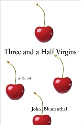
John Blumenthal - Three and a Half Virgins

Another well made cover. Simple in design with only a little bit of color but fits the book perfectly. Title and author easily seen and read. This author got it right while still using a pale/white background color. There's a thin edge around the cover, leading to a clear break-up between the cover and the background image on the web page it is on. Without this thin border, the white background image could have easily been lost and the 'pop' of the cover along with it. See #11This well designed and eye-catching cover led me to read the blurb and add this novel to my To Be Read list. 
www.threeandahalfvirgins.net Facebook


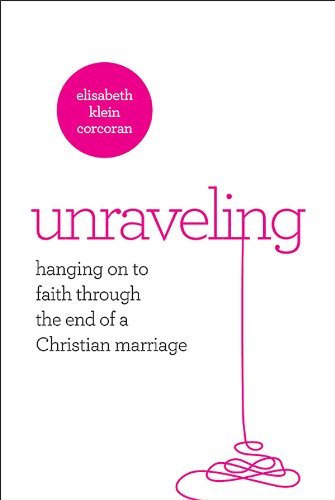
Elisabeth K. Corcoran - Unraveling 
(Publisher Abingdon, Cover design by Gearbox)


The Title and also the main image of this cover really caught my eye. What a clever concept! Everything is easily read, even in thumbnail. As a reminder, like I mentioned above (See #11), you have to be very careful when using light/white backgrounds so the edge of your cover isn't lost in translation. This author did a great job having a thin border around her cover. I don't normally read Christian fiction/non fiction and the subject matter doesn't really apply to me but the blurb and cover are so well-done that I will probably read it anyway. Maybe it will teach me what to avoid so my marriage doesn't 'unravel'. ;) (yes I just went there. lol)
www.elisabethcorcoran.com


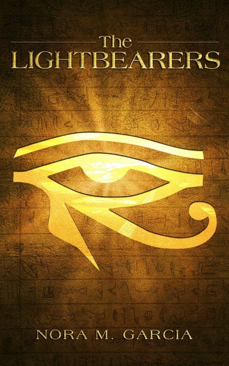
Nora M. Garcia - The Lightbearers 
(Cover design by Iconisus)


I guessed that this book had an Egyptian theme and was right. Another author who got it right with a cover that fits the book. The background image is beautiful and doesn't distract from the central and eye catching main image or the title and author. This is another author who chose not to list that this book is part of a series on the cover. Adding more text to this cover would have ruined it. The author was very clear in the description that this book is part of a series. After reading the blurb, I am adding this series to my To Be Read list.
Facebook  Goodreads


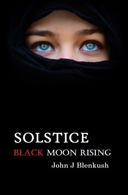
John J Blenkush - Solstice Black Moon Rising

This book is great simply because of the lack of images. The black background makes the image, title and author's name very eye-catching. I assumed in the wrong direction on what the book might be about but after reading the blurb, the cover does fit the theme. Also, it's the third book in a series and after seeing this title and reading the blurb, I'm putting all three books on my To Be Read list.  For this particular novel, adding that it's book 3 on the cover would've taken away from it's gorgeous simplicity but the author is very clear that it's book 3 in the description. :)
www.jblenkush.com    Facebook    Twitter


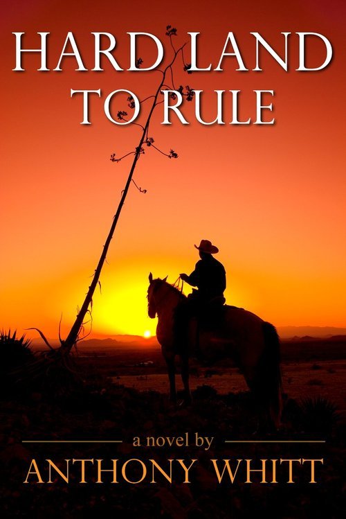
Anthony Whitt - Hard Land To Rule

This cover really caught my eye. Normally I skim over anything that looks like a western since I don't really read westerns. Adding to my general avoidance are the usual cliche western covers with a half naked cowboy on them. This cover is anything but cliche. The image lends to the book's title. A bare landscape, scraggly tree, hot sun and a lone cowboy (refreshingly fully dressed) looking out over it. The title and author are clearly seen and easily read. This well-made cover led me to read the blurb which was also well-done enough for me to put this post-Civil War western on my To Be Read List, which is not an easy accomplishment, especially for a western. ;)


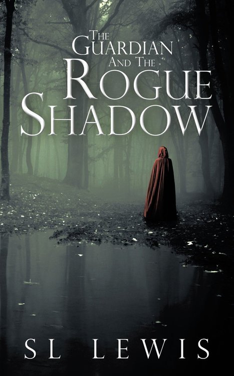
SL Lewis - The Guardian and the Rogue Shadow

I must say, I absolutely loved this cover. It's dark and mysterious. The lack of color brings your eye very quickly to the figure in the red cloak. The title and author name are easily read. I'd like to thank this author for not making his words have shadows underneath them. As seen in #6C, some authors think they HAVE to have shadowed words so they'll look cool and many wouldn't hesitate to shadow the word 'shadow' for obvious (but very wrong) reasons. This author is another that did not state this book was in a series on the cover but got it right. More words on this cover would've distracted from it's eye-catching appeal. The author clearly states it is book two in the the description. I liked the sound of this series so much that I added it to my To Be Read list.

Author's Amazon Page


So hopefully you've gotten the idea when creating the cover for your book. There are LOTS of mistakes you can make and hopefully this blog post will help you avoid them! :)

Special thanks to all the authors who gave me permission to use their great covers in this post! (could only link ones with Google+ profiles here)
+Chelsea Dorsette 
+S. L. Lewis 
+John Blenkush 
+Chelsea Dorsette 


Thursday, December 5, 2013

Writing a Convincing Villain - Thursdays with the Author

Question: How do you put yourself in the villain/monster/antagonist shoes and write it convincingly?


Answer: This is actually one of the harder parts of writing for me. I don't see myself as a bad person and I try my hardest to be kind. So having to think like a 'bad guy' while writing one is very difficult. In my last book, Dark Mountains, I had to write a convincing villain who was physically and emotionally abusive and actually went as far as murder. Have I ever murdered? No. Have I ever physically abused someone? No. Have I ever emotionally abused someone? I sure hope not. But I had to write about a character that made it feel like I had first-hand knowledge. 

The research was the hardest part. I scoured sites on domestic abuse, read posts from murderers and abusers, interviewed victims of violence. Anger, judgement and revenge filled my thoughts when reading perspectives of horrible people. Sympathy, pain and the desire to help and comfort all sprung up in me when speaking to abuse victims. I had to push all those feelings away. I couldn't let them cloud my thoughts when I had to put on the mental shoes of the bad guy. I had to hate, seek revenge, give into psychotic thoughts. I had to be greedy, full of hate and anger. Be driven by unknown demons. 


While I was writing that villain, I had to mentally become him. I sure didn't like it. In Dark Mountains, Jackson Michaels was ugly. Horrible. Dangerous. Scary. And so was I while I wrote it. I almost felt dirty when I was done. Tarnished by the thoughts I had to think and use to create the character.


But then I went back through the book in editing and I read what I wrote and I hated him. Which is exactly what I wanted the reader to do. By the end of the book, as the villain finally got what was coming to him, I rejoiced. As did the readers that have reviewed my book so far. My villain was hated and despised enough for some readers to actually cheer for his demise. I had to go to some ugly places in my head to create him but he made the reader feel and that is the whole point. 

In my next book, Irish Strength, the major villain is an actual monster. An ancient race of Celtic gods coming back for revenge after thousands of years of silence. The things this monster does during the course of The Irish Treasures Saga, makes my last villain look like a playground bully. 

Researching a mythical monster is much harder. There are no interviews with victims, no first-hand accounts to go by. I did a lot of research on myths, movie monsters, etc. But all of those reasons that make research harder, makes the actual writing easier. Since monsters are myth, fantasy, completely fiction, I can have a lot more creative license. Since I have no first-hand accounts, I can make my monsters truly terrifying without feeling the guilt or sorrow when writing about real-life events. Of course, the effect on my characters and their reactions has to be realistic, regardless of the extremes the monster goes to.


Another kind of villain or antagonist are the ones who are a main character in the story. They can even end up being the hero or heroine. These bad guys/girls can be pretty bad at times but the key to writing them, especially in romance, is that they are redeemable. 

Readers see this a lot in historical romance: rakes being reformed, arrogant lords being humbled, bandits earning respectability, overly macho Scotsmen finding sensitivity. All of these characters start out making the reader annoyed. They think: Yeah he sounds gorgeous but what an ass!


Then by the end of the story the bad boy is tamed and love conquers all. That may sound cliche but if you make your bad guys deep and their redemption even deeper, the reader doesn't see a cliche. The reader sees a hero. 

Of all the different types of villains you can write about, all of them have to be special to your novel. They can't be simple, stupid, easily defeated. They have to be complex, chilling, not easily overcome. What makes the villain tick? What are the reasons behind the bad behavior? For human villains, there's usually always a reason. Even psychotic killers get pushed in that direction by something. 

Don't be afraid to let your mental dark side out of the cage when writing bad guys. Just remember that the reader has to connect to the characters, even the villains. That doesn't mean they will like every character. They may hate the character. But they connected enough to care and that's what matters.