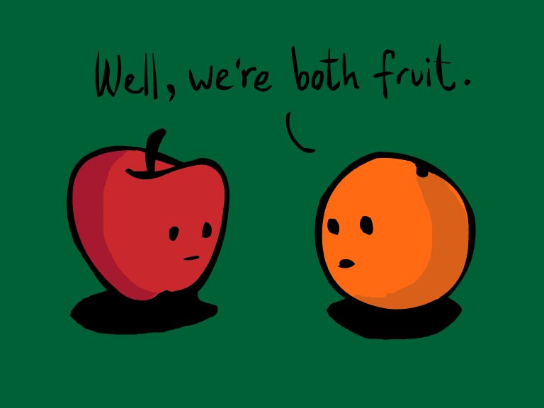
We've all seen the 'typical' cover for the genres we like to read.
In Historical Romance you see the dashing aristocrat with tight breeches being clung to by the beautiful woman with her dress halfway off her body. Or the muscled Scotsman, kilt, and not much else, ripping the woman's dress off with a look of masculine passion.
In contemporary romance, long legs with high heels, even though she's wearing nothing else. Or the sexy man in a suit, his rippled abs bared beneath his jacket. Because what savvy business man wears a shirt beneath his suit jacket?
In mystery and suspense we have a blade or weapon in the forefront and perhaps a shadowy figure looming in the background. Shattered glass with a perfect bullet hole, or crime scene tape and police car lights.
In Women's fiction, recently, you get a house, maybe in the woods or on the beach, with a front porch or smoke curling from the chimney. You might get lucky and have an animal somewhere on the cover, or something on a table that might have something to do with the book.
In YA just a close-up shot of a girl's face, maybe even the whole body, usually doing nothing that has to do with the book.
In Dystopian you get a symbol or some type of unknown imagery that won't make sense until the book has actually been read.

In Westerns, particularly the Romance kind, you'll have a hot cowboy, not a speck of dirt on him, maybe throwing hay without his shirt on, because there's no way hay is itchy in anyone's skin, and definitely no way that a cowboy's work will actually make him dirty. Just a regular ole' Western? Expect a regular ole' cowboy on a regular ole' horse.

In paranormal you can get a sexy vampire that looks completely human, not counting the fangs dripping in blood. Or a shape-shifting hottie, with a well-defined 6-pack, a bunch of tattoos, and walking around in leather pants without a shirt, because a half-naked, tattooed, muscle man is a sure sign of a shape-shifter.
The only genres that seem have the most original covers are fantasy, sci-fi, and children's, mostly because each world is completely made up, so no one else is going to have the same cover.
Of course, not every novel has the same cliche, stereotypical, cookie-cutter cover, and kudos to those authors that bucked the trend. Still don't believe me? Go to Barnes and Noble, or any book section, in any store, and check out the different genres. Look at the romance section: Can you count on two hands how many covers have at least one person missing clothing? Or making out? Or both? You'll probably need more than ten fingers to count. Check the western section: Lone horse and rider? Cowboy half clothed? Scene with said cowboy doing something that no actual cowboy would do? How about YA: Strangle symbol? Single girl's face or body doing something like standing, or sitting?
Go check it out. The amount of covers that all look the same are astounding.
Am I saying you shouldn't put any of those 'traditional' images on your cover? Yes and No. It really depends on your novel and what you think fits. But what you don't want to do is have your cover looking like everyone else's. Remember my tip from the Creating A Cover For Your Book - What You SHOULD Do, I recommended going to the store and taking a picture of the books in your preferred genre. Take it home and compare your book to those in the picture. Do you stand out? Are you unique and eye-catching? Do you stand out too much?
Don't automatically go for the cliche and stereotypical. You risk getting lost between the dozens of other books with the same cover.
You know how people say, 'You can't judge a book by it's cover,'? You shouldn't, but the sad fact is that people DO judge a book by it's cover. Half the time, when they're doing an online search, the cover is the ONLY thing that comes up. They have to click on it to read your blurb. People at book stores don't pick up every single book to read the back when deciding. They look at the covers, for the author's name, title, and imagery, to help them decide if they'll like the book. IF the cover catches their eye, they'll click on it, or turn it over, and read the blurb. The blurb, or back of the cover, needs to be just as good as your cover. Because the cover AND the blurb are what gets people to click buy or put it in their shopping cart/bag.
I've written on the cover of subjects MULTIPLE times on this blog and mentioned it in MULTIPLE posts because I believe it is very important. And it's one of the things authors neglect the most.
You can find my cover posts at the links here:


