Creating a Cover For Your Book
What You Should Do

Back in my post Creating a Cover For Your Book - What Not To Do, I went over some humorous and important things to avoid when creating a cover.
Today's post will contain some things you should definitely be sure to include while making your cover.
If you can afford it, hire a reputable cover designer, and let them create the masterpiece for you. But if you're like me, and spending the money is NOT an option for you, check all these tips to make sure you're doing it right! :)
1) Quality Images
300 DPI (dots per inch) is the minimal requirement for nearly every self-publishing company. When searching for images online, typing HDR (high definition resolution) will (usually) weed out any low quality images.

2) Don't Sacrifice Quality for Size
If keeping the quality of an image means the image won't fill the front cover, stick with quality. Quality of the image, even the font, should never be lost. It's better to have a beautiful and clear picture, than something blurry or grainy.
3) Title and Author Must be Easy to Read
No crazy, confusing fonts. No small font size. The title and author name should be clear and very easy to read. Some authors like to have their name larger than their title, while others prefer the opposite, or equal sizes. If you are a new, or relatively unknown author, your name should NOT be bigger than the title. When you are well-known enough that your NAME is what sells the book, THEN you can have your name equal or greater in size than the cover. Examples: Steven King, Tom Clancy, Nora Roberts, Nicholas Sparks.

4) Pick a Theme and Stick With It
4) Pick a Theme and Stick With It
Your cover shouldn't be tying to explain every theme that happens in your novel. Pick a main theme or general appearance you'd like to convey, and stick with it. This goes for images, fonts, and general colors. Ever heard of the saying, 'less is more'? This applies to your book cover as well. Sometimes the simplest cover is the most stunning.
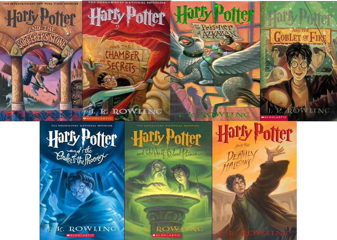
This tip also goes for series. Each cover should be different but fit the overall theme of the series. Here's what my series covers look like:


This tip also goes for series. Each cover should be different but fit the overall theme of the series. Here's what my series covers look like:
5) Have Something in the Background
Color, texture, a background image. DO NOT leave the background white UNLESS you have a border around the cover. A white background will be lost on retailer websites.

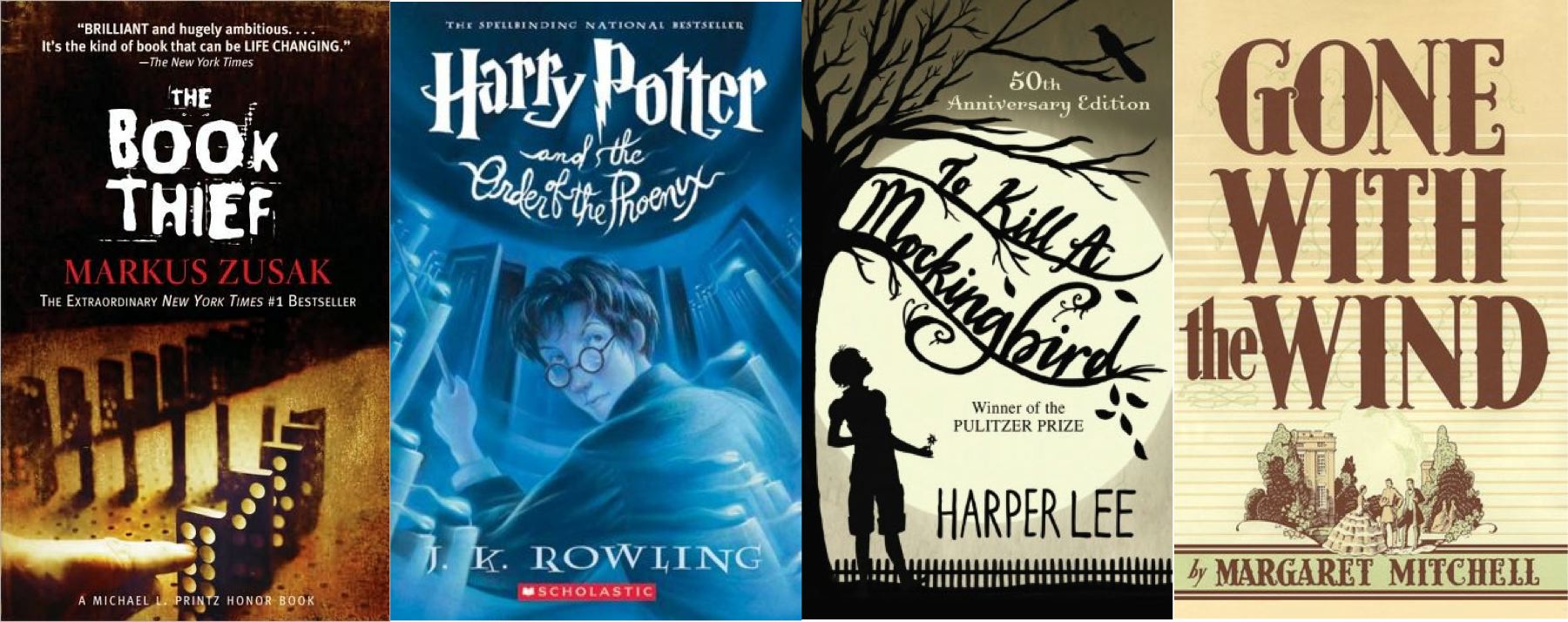
6) Use Contrast
White on black, black over white, red on black, orange over blue, etc. A central image, a line of text... make it stand out from the rest of your novel. Perfect examples of this are the Twilight Saga Book Covers.

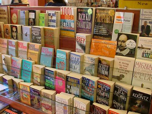
7) Put Your Cover Next to the Same Genre at the Store and See How Well it Fits In AND How Well it Stands Out!
You don't want your book to seem like it doesn't belong on that shelf but you do want to make sure it can be noticed when surrounded by all the other books out there. A good idea to try (and this goes for ANY genre) is going to your local store (grocery, book, etc), find the book aisles and the section with your genre. Take a picture of the shelves to take home and compare with your novel or the imagine in your head what your cover will look like, sitting on those shelves between all those other titles. If your cover won't stand out among the others, you probably need to change it. If it's stands out in a bad way, you probably need to change it.
White on black, black over white, red on black, orange over blue, etc. A central image, a line of text... make it stand out from the rest of your novel. Perfect examples of this are the Twilight Saga Book Covers.
You don't want your book to seem like it doesn't belong on that shelf but you do want to make sure it can be noticed when surrounded by all the other books out there. A good idea to try (and this goes for ANY genre) is going to your local store (grocery, book, etc), find the book aisles and the section with your genre. Take a picture of the shelves to take home and compare with your novel or the imagine in your head what your cover will look like, sitting on those shelves between all those other titles. If your cover won't stand out among the others, you probably need to change it. If it's stands out in a bad way, you probably need to change it.
No comments:
Post a Comment