Comparing To Other Writers -
Why You Should Be Doing Just That
I was recently reading submission guidelines for a publisher and came across something I hadn't seen very many publishers ask for. One of the requirements for the query letter was this:
" Please provide titles for up to three comparative books published in the past five years. These should be books that have a similar audience to your book and that you feel will compare with your book in the marketplace. Explain how your manuscript is different from these books. "
I must say, I was a bit thrown off by this at first. My book is supposed to be different and unique! Why would I want to compare it to other books?
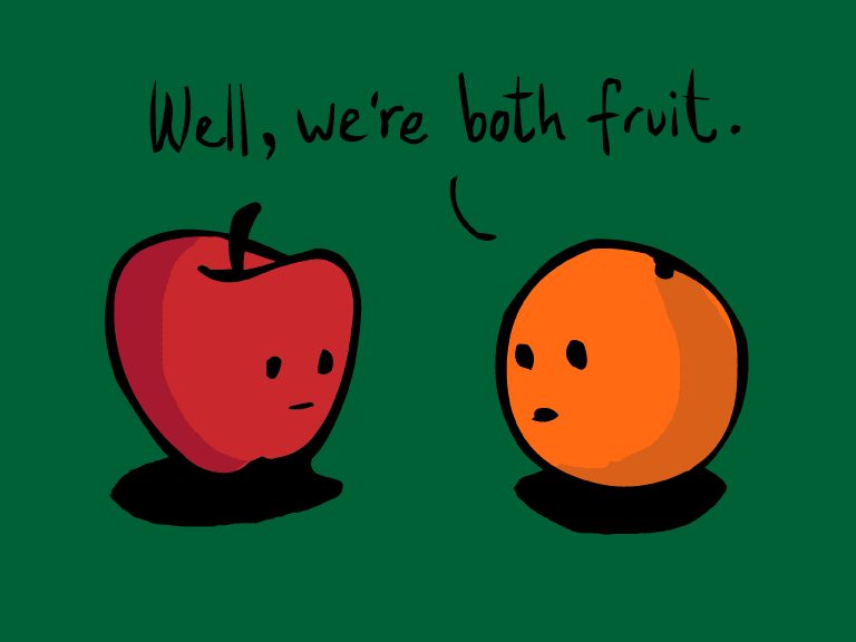
But this publisher has the right idea. As a writer, you have to know what your competition is. You have to be BETTER than your competition. More original, more memorable. If you don't know what your competition is with the book you are writing then you are definitely NOT ready to publish. How are you going to know how your book stacks up to the hot new releases and best seller lists if you aren't even paying attention to other writers?
Part of how we grow and learn as writers is by reading. It's one of the MOST important things we can do to improve our craft. Especially when it comes to the genre you write for. Are you writing a romance but only read mystery? Are you writing children's but never read any books for kids? Are you writing a YA/NA and have only read adult romance? You're bound to get something wrong. You're sure to have the wrong tone and inflection. You're nearly guaranteed to get the language wrong.
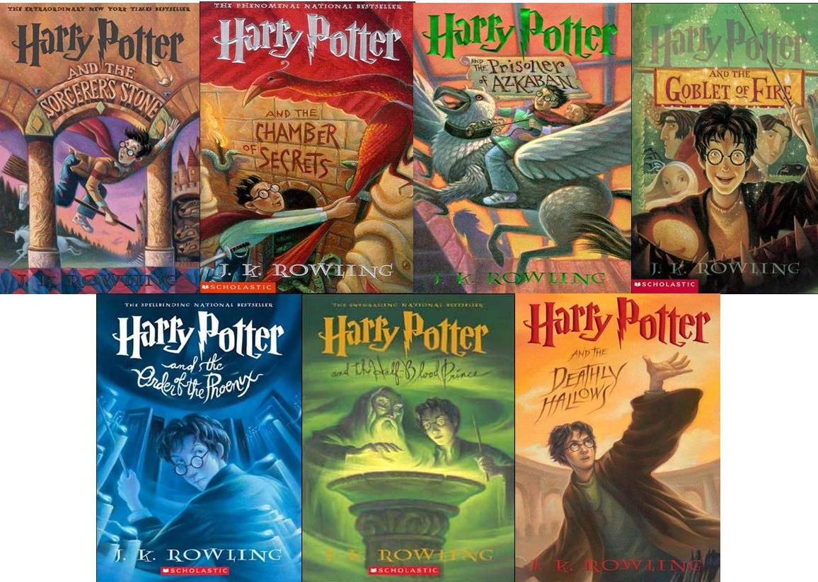
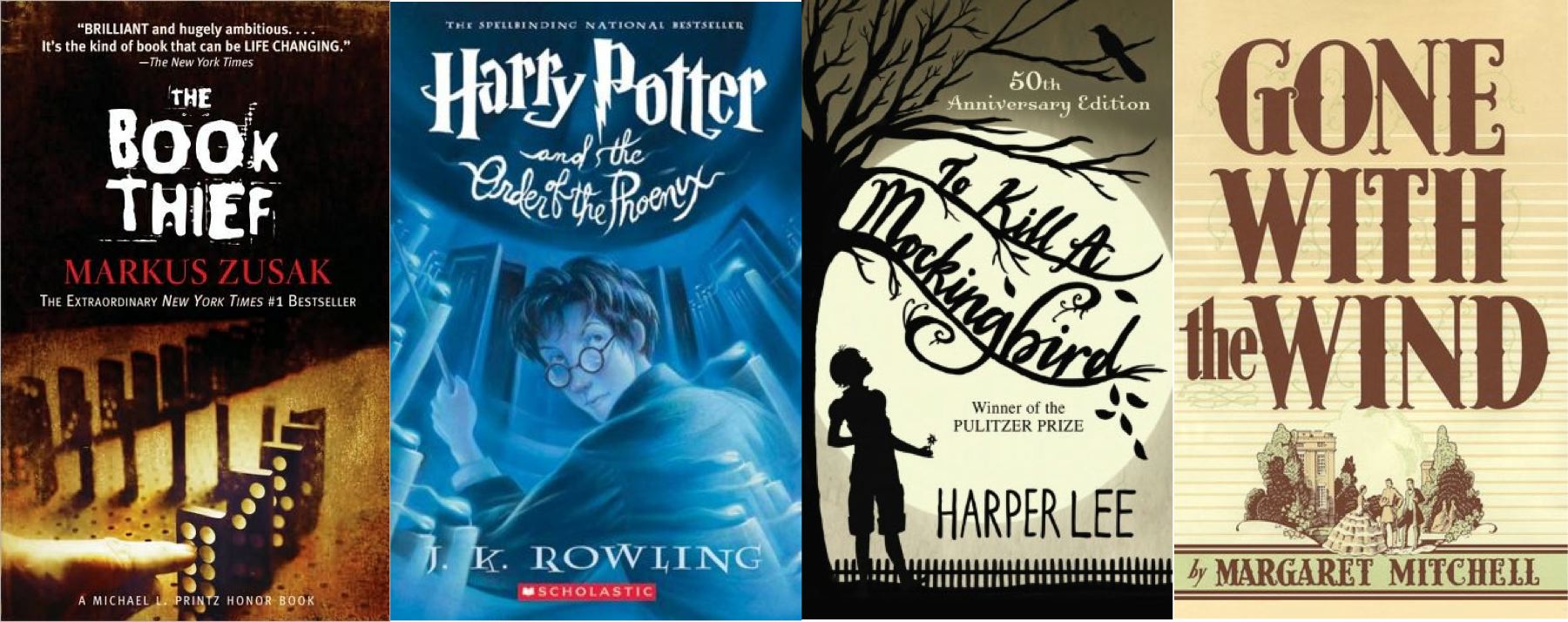
Even the cover can make or break your book. Go to your local bookstore or grocery store and find the section of books for the genre you're writing for. Take a picture of all the different covers. Take a picture of the blurbs on the back cover. Take a picture of the whole shelf. (Or write notes if you're worried about looking crazy for taking pictures at your local grocer.) Does your book stand out? Does it fit in at all? Is the blurb memorable compared to all the others there? Because if it stands out like a sore thumb, a reader might wonder if your book was maybe put in the wrong section. But at the same time, if your book looks and sounds like every other one on that shelf, they why is the reader going to buy YOUR book?
If you are writing romance, you need to be reading the top-sellers in that genre. Of course, there's a million sub-genres in romance, so you'll need to zero in on that as well. Contemporary romance? Nora Roberts, Danielle Steel, Robyn Carr, Nicholas Sparks. Historical Romance? Johanna Lindsey, Mary Jo Putney, Mary Balogh. Romantic Suspense? J.D. Robb, Jayne Ann Krentz, Carla Neggers. Western? Diana Palmer, Dorthy Garlock.
Same with any other genre! Young Adult? Veronica Roth, Rick Riordan, Stephanie Meyer, Suzanne Collins. Science Fiction or Fantasy? Anne McCaffrey, George R.R. Martin, Anne Rice, J.R.R. Tolkien. Mystery/Suspense? John Grisham, Carol Higgins Clark, Catherine Coulter. Military? Tom Clancy, Tim O'Brien, Clive Cussler.
How about children's? Picture books? Dr. Seuss, James Dean, Mo Willems, Anna Dewdney. Early Chapter Books? Herman Parish, Mary Pope Osborne, Megan McDonald, Barbara Park. Chapter books to Middle Grade? Dav Pilkey, Jeff Kinney, Rick Riordan.
Look at the reviews for some of these author's books. Were the readers content/happy with what they read. Did they think it was missing something or had too much of something else? Reader opinion is highly valuable (though in some cases {like trolls} it should be taken with a grain of salt. But if a majority of reviewers are saying the same thing, then there's something wrong. Take what they are trying to say to the other authors and apply it to your own writing.
Read the books, surround yourself in the genre, look at the covers, read the reviews. Learning from other writers is the key to becoming a better writer yourself. And with some publishes, the key to getting your book out of the slush pile.