Showing posts with label readers. Show all posts

Monday, June 11, 2018

Your Brand - What is it and How do you Protect it? - Monday Musings

Your Brand - What it is and How do you Protect it? - Monday Musings - June 11, 2018


For pretty much everyone not living beneath a rock, the viral hashtag #cockygate has crossed your ears, computer screens, or phones in recent weeks. In the extreme off-chance that you don't know what I'm talking about, I'll try to sum it up quickly. You can also see my previous blog post, How to Alienate Your Readers and Tank Your Career - Monday Musings for a more in-depth explanation.


A romance author named Faleena Hopkins, who began publishing a series called The Cocker Brothers of Atlanta on June 16, 2016. The first book was Cocky Roomie, and all the subsequent books (there's 18 so far) have Cocky something as the title. Not too many people had heard of this relatively new author, until in early May 2018 when another author with a Cocky-something titled book, received a cease and desist letter from Faleena, stating that the WORD cocky was now copyrighted. Not the entire title, not the name of her series, but the single word, cocky. The trademark office should never have granted such a broad application for such a commonly used word but that's not the point. The point is, she copyrighted a single word on the excuse that she needed to protect her brand. The whole thing has since blown up in her face, she's shut down most of her social media sites to avoid confrontations with legions of authors and readers, and has actually sued and tried to set restraining orders on people. Specifically ones that she has a personal grudge against, and the author/retired IP lawyer that is petitioning for the trademark cancellation. The court date for that was today, and the judge shut Ms. Faleena down. The trial for the cancellation of the trademark is at a future date.


So now that you're up to date on what caused such a god-awful stink in the writing world, we'll move on to the Pandora's box it opened. Since Faleena's trademark, MULTIPLE authors have followed her misguided steps, and filed their own trademarks for single-use words. #RebellionGate, #ForeverGate, #DareGate, #ShifterWorldGate and many others have come to light, angering the writing community further and proving why the box that Faleena selfishly opened, should have been left alone, and preferably hidden in the 7th layer of hell. 
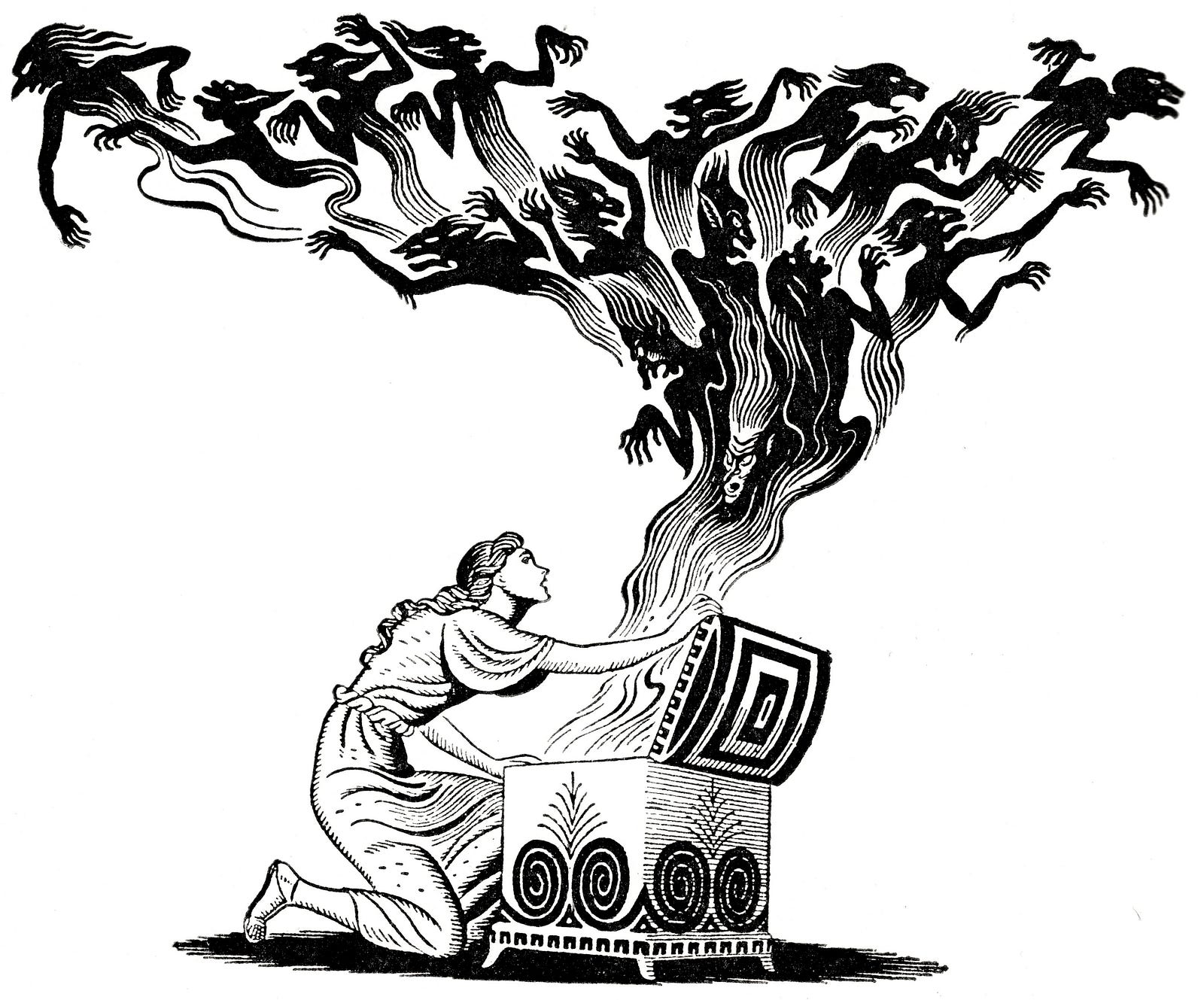

Image result for pandora's box


The going excuse for all these misguided authors keeps coming back to one recurring explanation: I'm trying to protect my brand. That's all it really boils down to. But all these authors are missing one glaringly important fact. Your brand isn't your title.


That's right. Your title has pretty much nothing to do with your brand. Your name and the content you create... THAT'S your brand. IT'S YOU. If the title or series name was so important, JK Rowling would have trademarked the title Harry Potter and it's very specific font. (She didn't btw, she trademarked the CHARACTER of Harry Potter), Stephanie Meyers would have trademarked the Twilight Saga and it's unique font, EL James would have trademarked the 50 Shades series. Yet NONE of those huge-name and very successful authors did that. Because the title didn't make the difference. People knew what to expect from each of those authors based on their names and the type of stories they had already delivered. 


EVERY author has to deal with crooks and scammers stealing their work and pirating it elsewhere. It's a universal problem. Basic copyright laws apply to everyone that's published to stop people from stealing their work, as long as they can prove they had it first. They can't sue for damages with a basic copyright, but they can stop someone from profiting further off their work. Authors can go a step further and pay to register a copyright. This allows someone to sue for damages if their work is stolen. Trademarking is the next step. Companies like Apple, Pepsi, GE, have all purchased trademarks for their logos and names, in specific fonts and for specific products. For example, Apple owns the trademark for the word in reference to electronic products. They aren't going to sue someone who writes a book called The Apple of Adam, or an Apple Juice manufacturer, etc. These companies have VERY specific TM's that are obviously protecting their very unique brands. 


If an author wants to trademark their series name (trademarking single titles is currently illegal), their series name needs to be unique and specific. In Faleena's case, she SHOULD have trademarked "The Cocker Brothers of Atlanta" (The original series name and still showing up on her covers as well as a 'Cocker Brothers' logo and all over her social media), or even "The Cocky Series" (Which, I'd like to add, she didn't start using until this spring AFTER she filed for the trademark.) But by trademarking just the single word 'cocky', she prevented a lot of authors from using it in their titles, forced some to change their already published titles containing the word (with a big expense also forced on them), and started a legal battle with previously published cocky-titled books.


So other than applying for a very expensive and possibly legal battle-inducing trademark, how can an author protect their brand?


Well let's start with what a brand, for an author, is. A brand is a consistent promise to a customer about what they're going to get. For an author, that means the content you deliver. To be clear, your brand is NOT your title. It's what's between the cover. The content. The STORY. 

Image result for brand


Harry Potter's title might be recognizable, but it wasn't the title that got people to invest in JK Rowling's brand. It was the story of a young boy, who'd already had a rough start to life, finding out he's actually a wizard and might just hold the fate of the world in his hands. Her brand follows the journey of that boy as he grows and becomes powerful and eventually saves the wizard and muggle world. 


As readers, we invested in Harry, Hermione, Ron, Dumbledore, Dobby, Hagrid, and more. We delved into life at Hogwarts, imagined receiving a letter from an owl, practiced spells with homemade wands. We spent hours reading those pages, going to the movies, buying merchandise, writing our own wizard stories. The title had nothing to do with that. The brand she created by writing a hell of a series kept us with her, years after the first book was published. 


Even if Harry had been a Michael or Peter, the story wouldn't have changed. The first book could have been called Samuel Piper and the Philosopher's Stone and the story wouldn't have changed. The brand wouldn't have changed. Because it wasn't the title that made the brand, or even the names of the characters. It was the story that made the Harry Potter brand what it was and continues to be today.


Related image

So how do you protect your brand?


You write unique, original, and amazing stories. That's it. Yes, scammers will try to steal your work and sell it on iTunes. Thieves will try to copy your story and sell it as their own. It happens... to EVERYONE. But the stories you write, throughout your career, will create your brand and keep it safe. Readers will come to know your series characters, your style of writing, your voice. They will keep coming back, again and again, even when you write different stories, or start a new series. Because they know that YOU will give them an amazing story that they will fall in love with. They know YOU will write characters so real, it's like they were sitting next to them, characters they will get to know and keep thinking about long after they read 'the end'. Readers will know YOU and the quality of books you'll put out. A single title or a series will draw them in, and the content you deliver will keep them as fans as long as you have books. 


So the moral of this blog post is, don't be a grade A asshole and start trademarking words that are commonly used. Trademark an entire series title if you feel you must but it won't make a difference to your readers. As long as you're writing amazing stories, they won't care what your titles are or who else might be writing something similar, they'll care about YOU and what you're writing. A trademark won't protect that. YOU protect that, by being an amazing writer.



Monday, July 7, 2014

Irish Heart is now live!!!!

Irish Heart (Irish Treasures Saga - Book Two) is now AVAILABLE!!!!!!!!!
For Print edition, the best place to purchase is from the manufacturer (no middle man) at CreateSpace
eBook edition can be found at Amazon
You can find all my books at Author Central
Also, If you've read Irish Strength and would like to leave a review, I would greatly appreciate it! If you purchased Irish Strength, you can leave a review on the amazon page. If you received it as a gift, you can leave reviews on Goodreads.com. 
Thank you all for your support!!!!!!

Thursday, December 12, 2013

Creating a Cover for Your Book - What NOT to do - Thursdays with the Author

Update: the Coverscroll website is no longer running. But if you go to google search and type in bad book covers, you'll see exactly what I'm talking about. ;)


The cover for one of my books

I always check out my new Twitter followers and one of my newer ones this week was a website that will let you promote your book for free (donations accepted) which I think is a great resource for writers. 

As I was browsing their website I saw perfect examples of what self-publishing and indie press authors should absolutely NOT DO when it comes to designing a cover for their books. 


There are some good covers that I found, which I will feature further down in this post (with the author's permission). Of the good ones, seen below, I read the blurbs after the cover caught my eye. And I will most likely purchase all of them because I like how they sound. But the first thing that caught my attention (as a reader) were the covers.

Some of these good covers were done with publishing and/or design companies. If you have the money and/or means to go this route, please do. They know what they're doing. But if you don't, the list of do's and (mostly) don'ts found below can help you make a great cover on your own.

I won't post individual pictures of the 'what not to do's' at the risk of being sued by someone so you'll have to check the website out for yourself. It'll be pretty easy to understand what I'm referring to. Take a look and see what you think: http://coverscroll.com/


Here's a few tips I have for designing a cover. They are mostly (well practically all of them are) what NOT to do:

1) Do NOT use a friend or family member as your model just because you needed someone to pose for a picture. Having an obese woman in lingerie trying desperately to look sexy and failing badly while holding a giant carving knife between her bare legs is a BAD IDEA. This is NOT the cover you want to have unless you main character is a overweight serial killer that has some strange sexual fantasies, then the cover might fit but it still won't get anyone to read your book. 

2) Do NOT use a crappy, pixelated picture that looks like it was taken by your five year old child on a toy camera. Pictures should be clear with a high DPI (most sites recommend 300DPI). That means a very high resolution shot if you didn't know.

3) Do NOT take a picture you found off a Google search engine and slap it on your book then paste some really crazy looking graphic on top of it with your book's title and your name squeezed in the only free space. Just don't. Also see #12.

4) Do NOT use a hand-drawn image/picture as your cover. The ONLY exceptions to this would be if you are an amazing artist (professional schooling is a big plus here) or your book is a children's book. I will be so distracted wondering what the heck you even drew on your cover that I won't even read your blurb or check out your reviews. Books ARE firstly judged by their covers so don't make the mistake of putting a elementary school quality artwork on your cover. Books are secondly judged by their blurbs. Your cover will get them to read your blurb so make sure it is good too!

5) Do NOT put small/confusing fonts,  subtitles, or small blurbs on the front cover. This goes for cover images as well. Most people will be looking at a thumbnail image of your book's cover. If it doesn't look good or can't be seen in a thumbnail, you need to change it.

6) TEXT: I have a few points on this topic. 
A) Make sure all the words and letters can be CLEARLY seen and EASILY read. Images and backgrounds should not be cutting into lettering or obscuring them from vision. 
B) FONT: One example I can give is: the word 'Aunt' looks like the word 'Cunt' in certain fonts. Seriously. (For those of you outside the US, here the word cunt is a very derogatory word, usually directed towards women. Not the word you want in your title or in thanking your Aunt on the dedication page.) 
I saw a few titles with the letter 'D' in a font that appeared to be dripping blood. It made the 'D' look like a 'P'. This makes the word Deed look like Peed and Doubt look like Pout. It would look bad if your title read 'Without a Pout'. DOUBLE CHECK to make sure your font isn't causing these type of issues. This also ties in with #5. Some fonts cannot be read as thumbnails. Check your fonts. 
C) DO NOT use the shadow effect on your title. A lot of the books on this site had the words being mirrored underneath. This is distracting and looks amateurish. 

7) Titles. Please don't have your title be fifteen words long. JUST DON'T. Also, titles should also have something to do with your book. Foreshadowing or theme. But not so literal as the reader wants to do a face palm. Example: Your book is about a serial killer who dresses up as Santa and murders Christmas shoppers. DO NOT call your book Serial Killer Santa. Killer Christmas is cliche (also: will probably cause an eye roll or face palm) and it's STILL better than Serial Killer Santa.

8) Unless you are writing a children's book or certain types of non-fiction, or an ACTUAL comic book, your cover should NOT look like a cartoon.

9) If there are multiple authors, it might be best not to name every single one of them on the cover of your book. Try: 'A collaboration' or something like that and list the authors/contributors in detail inside the book.

10) If you're going to have half naked, mostly naked, scantily clad, suggestive, provocative, etc. person(s)on your cover, make sure you do the following: 

A) The scene actually has something to do with your book. A tropical paradise complete with ocean waves and palm trees with bathing suit clad hotties rolling in the sand should not be on your cover if the book takes place in Minnesota... in the winter.
B) The people are at least somewhat attractive. Let's be honest here. We know men and women, in real life, are not perfect. Most of us don't even care what our significant other looks like (well maybe we care a little). But we read to escape reality and that escape isn't a man with a beer belly who's too lazy to shave or a woman with more chins than fingers. We want to see six pack abs and a hint of a five o'clock shadow on a sculpted face, or legs (preferably shaved) that go for miles and perfect boobs. Reading is fantasy so it's okay for us to indulge in our unrealistic and stereotypical fantasies.
C) The pose is somewhat attractive and age appropriate. A reader isn't going to want to read your 'steamy erotica' if they're too busy laughing at a ridiculous cover.  Example: A grandma-aged woman with her legs spread out and the title of your book barely covering the part of her body we really don't want to see. A reader is also not going to want to read about someones 'biggest hustle' yet the person on the cover doesn't look old enough to even know what a hustle is.
D) This ties in to #1 and #2. The picture needs to be good quality. The models need to be professional.
E) Just because it's a romance novel doesn't mean you have to have two half-naked people making out or tearing each other's clothes off on the cover. Don't get me wrong, that doesn't stop me from reading romance novels but cover after cover of horny couples gets a little old. This doesn't mean that you shouldn't put two hotties getting it on for your cover, just don't go overboard with it and try not to let it look too cliche.

11) Check the color! Especially with the cookie-cutter templates some self-publishing companies give you to choose from. If the background is pale/white, all that may show up on your cover may be the title and image. Make sure the color is dark/different enough to see the entire cover regardless of the background color of a website or make sure you have a thin border around your cover to distinguish it's lighter background from the web site's color.

12) For those of you completely new to publishing/self publishing, the biggest thing you need to know is that you absolutely have to have permission to use someone else's image. This may seem like a no-brainer but some people don't realize this fact. Just because you found a great image on a Google search doesn't mean there's no copyright. Most images on the Internet are copyrighted. Using a copyrighted image without permission from the original owner is ILLEGAL. Sometimes getting permission is as simple as asking the owner of the image to use it. Sometimes it's impossible to even find the owner. Sometimes the owner wants compensation (aka $) or credit in your book. If you can't get permission, DON'T USE IT. You don't want to risk getting sued. Even in this blog, I found the author's to all the books listed below and asked for permission to use their images and names before posting.

Here's an example: For my next book, which is being released in a few weeks, I found an AMAZING shot of an Irish castle. After scouring the Internet for the original owner of the image, I found him (in Greece, no less) and asked what I'd need to do to obtain permission to use his photo on the cover of my book. A lot of international emailing later and the deal was made. In exchange for using his photo (for my book cover and marketing for said book ONLY) I needed to give him credit on the back cover of my book for the photo, send him a copy of the cover for pre-approval before publishing, and send him 2 copies of the book after publishing. I got lucky finding a very polite and generous owner to negotiate with. I did go a little overboard and asked for a signed 'contract' just to cover my butt in the future, and he graciously complied. 


Another example: My cover of Dark Mountains is just a background image of mountains. I had found this picture that I absolutely loved, of a marine kissing his girlfriend's forehead. It was a sweet and beautiful B&W image and completely fit the theme of my story. There was no skin or suggestive situations, only a soldier in uniform saying goodbye with a innocent kiss. (Not saying my novel didn't have sex in it but it follows the main character's love story from childhood best friends and the sweetness fits the overall theme better. Also I have a thing against every romance cover having half naked-people on it. See #10. But I digress.) 

I emailed the blogger where I found the picture and asked if she could direct me to the original owner. She emailed me back saying that she had obtained permission to use the photo on her blog but could not find her info on the picture's owner (the cynic in me was screaming B.S.). But regardless, I couldn't find the original owner and couldn't get permission so the picture that I absolutely loved couldn't be used. I still haven't found an image that I love like that one, which is why Dark Mountains still has a somewhat plain image as the cover. I'd rather have a great, non-distracting background image than a picture that doesn't fit my book.

When it comes to finding owners and gaining permission, it won't always be that easy and sometimes it won't even be that hard. But if you want the image on your cover, you have to do what it takes to get permission.


Some images and artwork are so old that they don't have a copyright. Check your country's copyright law before using any images that are 100+ years old.

13)  If you can, if you have the right program and expertise, DO design your own cover from scratch. Cookie cutter templates from sites like CreateSpace, SmashWords, Kindle Direct, etc. are just that. Cookie Cutter. Regardless of how many choices they offer you, someone else will have the same looking image or template. Even with the 2 million + titles (and that is just in the Kindle store) someone will use the same template, colors, etc. 

If you can create your own cover from scratch you have much more freedom with color, fonts, layout, etc. But it's also harder. You have to know exactly how big your book is, page count, size, bleed, spine width, etc. There's even a math equation to figure out exact dimensions. It's all very confusing. But if you take your time and learn as much as you can BEFORE trying it, it isn't as scary as it first appears. I personally use Microsoft Publisher but there are MANY other programs you can choose from.


14) DO get opinions from as many people as you can before publishing with your cover. Friends and family are great, but be honest with yourself, they may not be up front in their opinions because they are family or a friend. Facebook, Google+, Twitter, Community boards on the self publishing sites: All of these are good places to get opinions on your covers. Now keep in mind, just like with your actual book, you won't please everybody. But if the majority likes it, then they're probably right. If the majority hates it, don't get too upset. Use it as a chance to learn. Ask for honest critiques and advice, and take it when given. 

The great thing about being an author is that it isn't a cut-throat business. Authors aren't out to sabotage each other. At least not in the self-publishing realm. We help each other. We learn from each other. Remember that fact when someone tells you your drawing is pretty bad and you shouldn't use it. Don't get pissed. Try looking at it like it isn't yours and you may find they were right.


15) Series: If your book is part of a series put the order somewhere on your cover. This rule isn't always best, especially if it distracts from your cover or the series has a long name etc. Some of the authors below chose to leave the series number off their covers. Keep in mind, if it's not listed on your cover that your book is part of a series, make sure you have it listed in your book's description. From personal experience I can tell you that reading a book and finding out half way through it that it's the second, third or whatever, in a series is very aggravating.


So those are some of my do's and (mostly) don'ts for creating a cover for your book. I am, by no means, an expert. Just another author who has learned some lessons the hard way and would like to help you avoid doing the same. :)


Here's some of my picks (from the above mentioned website) of well-made covers and why I like them. The Author's Name, Book Title and Covers all have links to the author's various websites. Please click on them and check out these authors and their books!


Chelsea Dorsette- Match Point

I love black and white images. This cover doesn't have too much going on, which is good. Hot guy, not too risque or cliche with the pose. Tennis racket ties in well with the book title. Title and Author name clearly visible and easy to read. I read the blurb for this book and the title and cover fits perfectly with the description. I don't read erotica but this cover and blurb has me thinking about changing my mind.
Chelsea's Blog


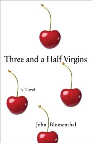
John Blumenthal - Three and a Half Virgins

Another well made cover. Simple in design with only a little bit of color but fits the book perfectly. Title and author easily seen and read. This author got it right while still using a pale/white background color. There's a thin edge around the cover, leading to a clear break-up between the cover and the background image on the web page it is on. Without this thin border, the white background image could have easily been lost and the 'pop' of the cover along with it. See #11. This well designed and eye-catching cover led me to read the blurb and add this novel to my To Be Read list. 
www.threeandahalfvirgins.net Facebook


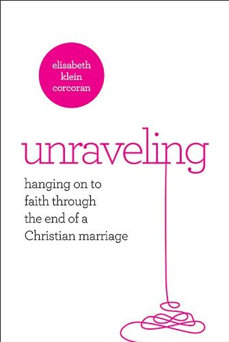
Elisabeth K. Corcoran - Unraveling 
(Publisher Abingdon, Cover design by Gearbox)


The Title and also the main image of this cover really caught my eye. What a clever concept! Everything is easily read, even in thumbnail. As a reminder, like I mentioned above (See #11), you have to be very careful when using light/white backgrounds so the edge of your cover isn't lost in translation. This author did a great job having a thin border around her cover. I don't normally read Christian fiction/non fiction and the subject matter doesn't really apply to me but the blurb and cover are so well-done that I will probably read it anyway. Maybe it will teach me what to avoid so my marriage doesn't 'unravel'. ;) (yes I just went there. lol)
www.elisabethcorcoran.com


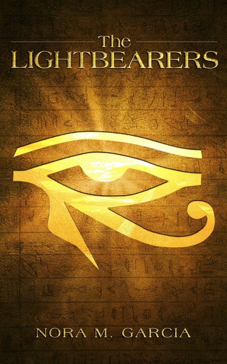
Nora M. Garcia - The Lightbearers 
(Cover design by Iconisus)


I guessed that this book had an Egyptian theme and was right. Another author who got it right with a cover that fits the book. The background image is beautiful and doesn't distract from the central and eye catching main image or the title and author. This is another author who chose not to list that this book is part of a series on the cover. Adding more text to this cover would have ruined it. The author was very clear in the description that this book is part of a series. After reading the blurb, I am adding this series to my To Be Read list.
Facebook  Goodreads


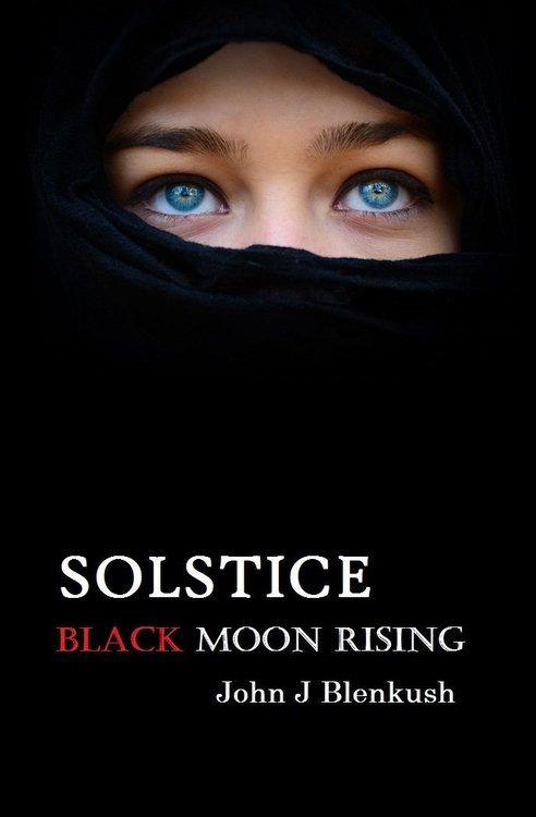
John J Blenkush - Solstice Black Moon Rising

This book is great simply because of the lack of images. The black background makes the image, title and author's name very eye-catching. I assumed in the wrong direction on what the book might be about but after reading the blurb, the cover does fit the theme. Also, it's the third book in a series and after seeing this title and reading the blurb, I'm putting all three books on my To Be Read list.  For this particular novel, adding that it's book 3 on the cover would've taken away from it's gorgeous simplicity but the author is very clear that it's book 3 in the description. :)
www.jblenkush.com    Facebook    Twitter


Anthony Whitt - Hard Land To Rule

This cover really caught my eye. Normally I skim over anything that looks like a western since I don't really read westerns. Adding to my general avoidance are the usual cliche western covers with a half naked cowboy on them. This cover is anything but cliche. The image lends to the book's title. A bare landscape, scraggly tree, hot sun and a lone cowboy (refreshingly fully dressed) looking out over it. The title and author are clearly seen and easily read. This well-made cover led me to read the blurb which was also well-done enough for me to put this post-Civil War western on my To Be Read List, which is not an easy accomplishment, especially for a western. ;)


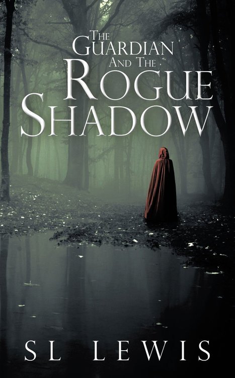
SL Lewis - The Guardian and the Rogue Shadow

I must say, I absolutely loved this cover. It's dark and mysterious. The lack of color brings your eye very quickly to the figure in the red cloak. The title and author name are easily read. I'd like to thank this author for not making his words have shadows underneath them. As seen in #6C, some authors think they HAVE to have shadowed words so they'll look cool and many wouldn't hesitate to shadow the word 'shadow' for obvious (but very wrong) reasons. This author is another that did not state this book was in a series on the cover but got it right. More words on this cover would've distracted from it's eye-catching appeal. The author clearly states it is book two in the the description. I liked the sound of this series so much that I added it to my To Be Read list.

Author's Amazon Page


So hopefully you've gotten the idea when creating the cover for your book. There are LOTS of mistakes you can make and hopefully this blog post will help you avoid them! :)

Special thanks to all the authors who gave me permission to use their great covers in this post! (could only link ones with Google+ profiles here)
+Chelsea Dorsette 
+S. L. Lewis 
+John Blenkush 
+Chelsea Dorsette